Your brand is only as strong as it is consistent—and without clear branding guidelines, consistency slips fast. If you’ve ever felt like your logo, colors, or messaging look different on every platform, this guide is for you.
Brand guidelines are the playbook for your business identity. They cover everything from tone of voice to logo placement, helping you stay recognizable across every touchpoint. And with 77% of marketing leaders saying branding drives growth, skipping this step isn’t an option.
This post breaks down how to make branding guidelines step-by-step—even if you don’t have a design team. You’ll learn what to include, how to format it, and how to make sure your brand shows up with clarity and confidence every time.
But First, What Are Branding Guidelines?
… and why your business needs them.
Branding guidelines are a set of clearly defined rules that show how your brand should look, sound, and feel across every channel. Think of them as your brand’s manual—keeping everything cohesive whether you’re building a website, posting on social, or handing off assets to a freelancer.
Why do they matter? Because consistency builds trust—and trust builds growth. Without guidelines, your brand can feel scattered and unprofessional. With them, you ensure:
- Consistency across platforms and campaigns
- Recognition that helps customers instantly identify your brand
- Professionalism in every piece of content, from business cards to Instagram posts
Even if you’re a solo entrepreneur, branding guidelines keep your visuals and voice on track as your business grows. And they make it easier to collaborate with others because everyone has the same map. We’ll break down exactly what to include in the next sections.
How to Make Branding Guidelines: A Step-by-Step Guide
Step 1: Define Your Core Brand Identity
Before you choose colors or sketch out a logo, you need to answer one essential question: Who is your brand, really?
Your core brand identity is what guides every choice you make—from messaging to design to marketing strategy. Without it, branding becomes guesswork. That’s why this first step is all about going inward.
Start with these:
- What does your brand stand for?
- Who are you trying to reach?
- What makes you different from others in your space?
Use your answers to shape your:
- Mission statement: Why your brand exists
- Core values: What principles guide your actions
- Target audience: Who you serve
- Brand personality: The traits that define your vibe (e.g., playful, polished, bold)
Voice vs. Tone—What’s the Difference?
Your brand voice stays consistent. It’s your signature way of speaking, writing, and showing up.
On the other hand, your tone adapts based on the context. Think of it as your voice’s mood—empathetic in a support email, upbeat in a promo.
Pro Tip: Run a Quick Brand Audit
Look at your website, socials, and emails. Do they reflect how you want to be seen? If not, now’s the time to close that gap. This clarity will make the next steps in your branding guidelines smoother—and way more strategic.
Step 2: Set Your Visual Identity (Logo, Fonts, and Colors)
Now that you’ve defined who you are, it’s time to show it. Your visual identity is how people see your brand—literally. From your logo to your color palette to the fonts you use, these elements shape first impressions and build recognition over time.
Here are a few tips to set your business’ visual identity:
A. Logo Guidelines
Your logo is the building block of your brand visuals, so clarity and consistency are key. In your branding guidelines, show:
Also include a few “what not to do” examples. For instance:
- Proper spacing around the logo (aka clear space)
- Approved backgrounds it can appear on
- Placement rules for web, print, and social
- Don’t stretch or squash it
- Don’t apply drop shadows unless specified
- Don’t swap out your brand colors
A visual guide like this avoids confusion—and ensures your logo always looks intentional.
B. Typography Rules
Fonts can say a lot without saying a word. Outline your:
- Primary font (used for headers or standout text)
- Secondary font (body copy or captions)
- Recommended sizing hierarchy (e.g., H1 = 36pt, Body = 16pt)
Make sure your typography feels aligned with your brand personality—whether it’s bold and modern or refined and minimal. Choosing the right fonts can make or break your visual identity. Here’s a guide to help you get it right from the start.
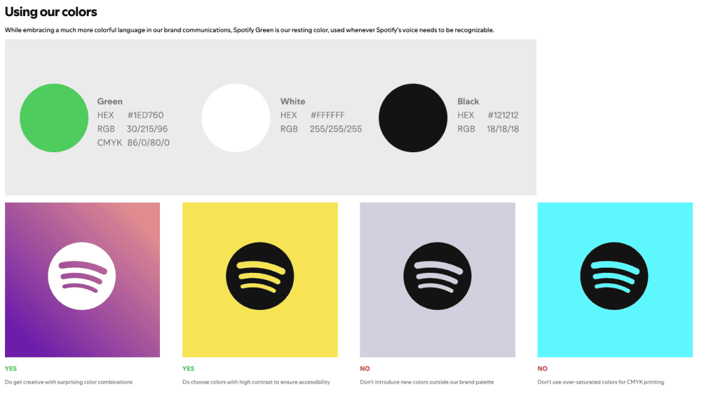
C. Brand Color Palette
Color influences emotion and recognition. Include:
- Your primary brand colors and accent colors
- A full HEX / RGB / CMYK breakdown for print and digital use
- Brief notes on color psychology (e.g., blue = trust, red = energy)
Tip: Use tools like Canva’s Brand Kit or Adobe Express to test and save your palette across assets.
Nail this section, and your visual identity will start working for you—creating instant brand recognition across every touchpoint.
Need a hand pulling your brand’s look together? At Pascual Creative, we help businesses craft purposeful visual identities—from logo rules to color palettes that actually reflect your brand personality. If you’re ready to stop guessing and start designing with clarity, we’re here to help.
Step 3: Define Your Brand Voice and Messaging Style
Your visual identity gets you noticed, while your brand voice keeps people listening.
Whether you’re writing an email, social caption, or homepage copy, your tone of voice should reflect your brand’s personality and values in a way that feels familiar every time.
Start by identifying your communication style. Are you friendly and casual, or polished and formal? Do you use humor? Do you keep things short and punchy or lean into storytelling?
A Few Quick Dos and Don’ts:
DO:
- Use clear, confident language (think NLP trigger terms like clarity, empathy, authority)
- Stick to your brand’s tone across channels
- Add helpful context—especially in support or sales messages
DON’T:
- Overuse jargon or buzzwords
- Flip-flop between casual and corporate
- Copy other brands’ voices—make it yours
Create a list of approved brand vocabulary and go-to phrases. For example:
- “Let’s build something bold” (yes)
- “Dear Sir/Madam” (not your vibe, skip it)
Well-defined content guidelines give every team member—or freelancer—confidence in how to write as your brand. Looking sharp is one thing, but sounding on-brand seals the deal.
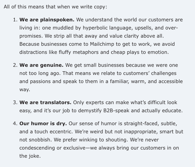
Case Study: Mailchimp’s Brand Voice
Mailchimp is known for its friendly, quirky, and human tone. Their brand messaging is clear, helpful, and often playful—without ever sounding unprofessional. Whether it’s a confirmation email or a homepage headline, the tone of voice feels like a helpful teammate who’s got your back.
Their style guide emphasizes using plain language, keeping instructions easy to follow, and adding just enough personality to stay memorable. For instance, instead of saying “processing complete,” they might say, “You’re all set!”
Here’s a snippet of their Content Style Guide
Step 4: Add Imagery, Icons, and Graphic Elements
Your brand isn’t just built on words and colors—it’s visual storytelling in motion. That’s where image guidelines, iconography, and other graphic design elements come in. They help maintain a cohesive look and feel across every touchpoint, from your website to your Instagram feed.
Create Consistency with Photography
Define your photography style clearly. Consider:
- Lighting: Bright and natural vs. moody and dramatic
- Tone: Editorial? Playful? Minimalist?
- Subject matter: People-focused, product-based, or abstract?
Decide when to use stock photos versus branded shoots. Branded visuals—especially with your team or products—often feel more authentic.
Design Rules for Icons and Graphics
For iconography, set guidelines for:
- Thickness (line weight)
- Color usage (stick to your palette)
- Do’s and don’ts (e.g., don’t use mixed icon styles)
When done right, your graphic design elements become a visual language of their own—recognizable even without your logo.
Step 5: Include Real-World Brand Usage Examples
Your brand guidelines shouldn’t live in a vacuum. Showing your brand in action helps others understand how to apply it whether they’re designing a flyer or writing a sales email.
Include practical examples like:
- Business cards with correct logo placement and font hierarchy
- Instagram posts that reflect your color palette and tone
- Email newsletters that showcase your voice, layout, and typography
These mockups or real samples turn abstract rules into visual proof, making it easier for others to replicate the look.
If you want to keep your branding scalable, create branded templates for commonly used marketing assets. Templates save time and keep things consistent, especially when you’re juggling multiple platforms or working with freelancers.
The more visual cues you give, the less room for guesswork—and the stronger your brand shows up in the real world.
Step 6: Organize and Format Your Branding Document
Your branding document should be easy to navigate, not just informative. The goal is to make it simple for anyone—designers, marketers, or freelancers—to apply your brand consistently.
Choose a clear brand style guide format, whether that’s a downloadable PDF, a live Google Slide deck, or a Notion page. Break the content into sections using headers, visuals, and short explanations to avoid overwhelming the reader.
Pro tip: For quick access, add a one-page “Brand At-a-Glance” that highlights your logo, colors, fonts, and voice. Small touches like these turn your easy-to-use brand guidelines into a tool people will actually use.
Step 7: Share It With Your Team (And Stick to It!)
Your brand guidelines aren’t doing much if they’re collecting dust in a drive folder. To maintain brand consistency, make sure your team actually uses them.
Walk internal stakeholders through the guide during onboarding or team meetings. Treat it as a branding SOP—not just a reference, but a working tool for internal branding and daily content creation.
Use tools like Notion, Loom, or Google Slides to link tutorials or resources. Most importantly, revisit the guide regularly. Team alignment grows stronger when your brand evolves with intention, not by accident.
Conclusion
Strong branding isn’t reserved for big-budget teams—it starts with having the right guidelines in place. Now that you have a jumping-off point on how to make branding guidelines, you’ve got the clarity and structure to keep your brand consistent wherever it shows up. Think of this as your first real step toward building a brand people recognize—and remember.
Need a hand turning your ideas into clear, cohesive branding? Pascual Creative builds brand guidelines designed to grow with your business—practical, polished, and purpose-built. Contact us today!