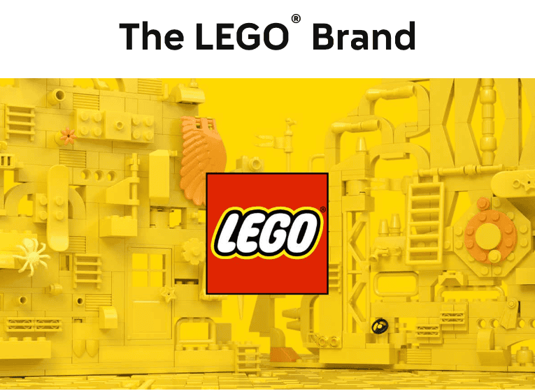
Imagine unboxing a sleek Apple product—the clean, minimalist typography signals innovation and simplicity. Now, think of a bold LEGO logo, bursting with color and playful energy. Instantly, you understand what the brand is about before reading a single word. That’s the power of typography—it shapes perception, builds trust, and makes your brand unforgettable.
Studies show that consistent typography can boost brand recognition by 80%, making it a powerful tool for building trust and familiarity. That’s why choosing brand fonts is more than an aesthetic choice; it’s a strategic decision. The right fonts reflect your brand’s personality, improve readability, and create a cohesive identity.
With small businesses spending $300 annually on font licensing, it’s clear that typography matters. In this guide, you’ll learn how to select, pair, and implement fonts that enhance your brand identity. Ready to learn more?
Understanding Different Font Categories
Choosing the right font for your brand starts with understanding the core font categories and their impact on how audiences perceive your business. Each type has its unique characteristics and applications, shaping the tone of your brand identity.
Serif Fonts
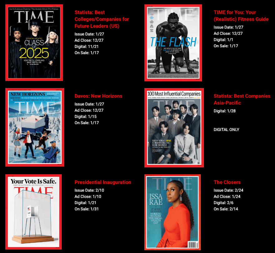
Serif fonts, with their decorative strokes or “feet” at the ends of letters, exude tradition, sophistication, and reliability. Think of brands like Time Magazine or Harvard University, which use serif fonts to emphasize trust and authority. These fonts are excellent for print media and can even increase reading speed by up to 15%, making them ideal for long-form content or formal industries like law and publishing.
Sans Serif Fonts
Sans-serif fonts strip away the decorative strokes for a clean and modern aesthetic. They’re the go-to choice for 70% of Fortune 500 companies, including tech giants like Google and Facebook, because they signal simplicity, clarity, and innovation. Their versatility shines on digital platforms, where readability on mobile devices is critical.

Script Fonts
Flowing and elegant, script fonts mimic handwritten lettering. They’re popular among luxury and lifestyle brands aiming to communicate creativity, elegance, or personal touch—think Louis Vuitton or wedding stationery designs. However, they require careful use to avoid legibility issues in smaller sizes.
Display Fonts
Display fonts are bold, decorative, and attention-grabbing. Perfect for headlines and logos, these fonts are often used by entertainment and creative brands like LEGO or Disney to evoke playfulness or uniqueness. While they work well for statement pieces, they aren’t ideal for body text due to their complexity.
By understanding these font categories, you’ll be better equipped to align your typography with your brand’s values and audience expectations.
Choosing Brand Fonts that Align with Your Brand Identity
Choosing a font isn’t just about aesthetics—it’s about storytelling. Fonts act as your brand’s visual voice, shaping how customers perceive your values, personality, and messaging. Whether your brand feels professional and trustworthy or playful and creative often depends on the typography you choose.
So, what do you want your brand identity to be?
- Clean and Modern Brands: If innovation and simplicity are your priorities, a sans-serif font like Helvetica or Open Sans sends a message of clarity and modernity.
- Luxury and Sophistication: For brands seeking elegance, serif fonts like Bodoni exude refinement and class, making them ideal for luxury industries.
- Authentic and Personal: Artisanal or creative businesses can use script or handwritten fonts to communicate warmth and authenticity.
Take Coca-Cola, for instance. Their script font evokes nostalgia and warmth, aligning with their approachable and timeless image. On the other hand, Airbnb uses a sleek, sans-serif font to emphasize simplicity and accessibility, perfectly reflecting their focus on connection and ease of use.
By matching your font choices to your brand’s values and story, you can create a memorable and cohesive identity that resonates with your audience. Typography isn’t just design—it’s an extension of your brand’s voice.
Factors to Consider When Choosing Brand Fonts
Beyond aesthetics, the right fonts have the power to make a lasting impact on your brand. The fonts you choose need to work across different platforms, speak to your audience, and visually represent your brand values. Here are the key factors to keep in mind:
1. Legibility and Readability
Your message won’t land if people can’t read it. Choose fonts that are clear and easy to read, whether it’s a digital ad, a billboard, or product packaging. Avoid overly decorative fonts for body text to ensure a seamless reading experience.
2. Versatility
Your font needs to look great everywhere. From large outdoor signage to tiny mobile screens, your typography should adapt to different sizes and formats without losing its impact. Test your fonts in various contexts to ensure consistency.
3. Uniqueness
Fonts are a key differentiator in a crowded market. Opt for typography that’s distinctive and reflects your brand’s personality. Custom fonts or unique typefaces can give your brand a signature style that stands out.
4. Cultural Relevance
Typography is deeply tied to cultural perceptions and can evoke associations that resonate—or clash—with your audience. For instance, serif fonts are often linked to tradition, refinement, and authority, making them a popular choice for luxury or academic brands. Meanwhile, sans-serif fonts exude simplicity and modernity, frequently favored by tech companies aiming to convey innovation and clarity.
It’s crucial to consider how your target audience will interpret your typography. A font that feels elegant in one cultural context might seem overly casual or outdated in another. By aligning your font choices with culturally relevant expectations, you can shape a brand identity that truly connects with your audience on an emotional level.
By weighing these factors, you can select fonts that not only look good but also work hard to elevate your brand identity.
Best Practices for Font Pairing
Choosing brand fonts is one thing—knowing which ones work well together is another challenge entirely. Combining fonts effectively can elevate your brand’s design and ensure visual harmony. Here’s how to pair fonts like a pro:
Guidelines for Combining Fonts
- Limit the Number of Fonts: Stick to two or three fonts to avoid a cluttered or inconsistent look.
- Choose Complementary Styles: Pair contrasting fonts that balance each other, such as a bold serif for headings and a clean sans-serif for body text.
- Focus on Hierarchy: Use different weights or sizes to distinguish headings, subheadings, and body text.
- Test for Readability: Ensure all paired fonts remain legible across different platforms and sizes.
Examples of Effective Font Pairings
- Playfair Display (serif) + Open Sans (sans-serif): A classic pairing ideal for modern, elegant brands.
- Montserrat (sans-serif) + Roboto (sans-serif): Clean and minimal, perfect for tech or startups.
- Raleway (sans-serif) + Lora (serif): A mix of sophistication and simplicity, great for lifestyle brands.
Tips for Consistency Across Materials
- Create a brand typography guide to outline font usage for headings, subheadings, and body text.
- Use the same font combinations across all platforms, from your website to printed materials.
- Regularly review and update font usage to align with evolving brand needs.
By following these practices, you can ensure your typography enhances your brand’s identity and maintains a polished, professional appearance.
Testing and Implementing Your Chosen Fonts
Before finalizing your brand fonts, it’s essential to test them in real-world applications to ensure they align with your brand identity and remain readable across different platforms.
How to Test Your Fonts
- Apply them to mockups (webpages, social media posts, packaging, ads) to see how they perform in various contexts.
- Check legibility on different screen sizes and print formats to ensure clarity at any scale.
Gathering Feedback and Refining Choices
- Share samples with team members, designers, or target customers for input.
- A/B test font variations in marketing materials to gauge engagement and readability.
- Be open to refinements—small tweaks in font weight or spacing can improve clarity and impact.
Ensuring Consistency Across Brand Touchpoints
- Create brand guidelines specifying font usage for headings, body text, and callouts.
- Use font styles consistently across your website, packaging, and promotional materials.
- Regularly audit brand materials to maintain uniformity and make updates as needed.
A well-tested, thoughtfully implemented font system strengthens brand recognition and ensures a polished, professional look.
Conclusion
The fonts you choose shape how people see your brand. Get it right, and you build trust and recognition instantly. The right fonts build trust, improve readability, and shape how people feel about your business. When chosen with intention, typography becomes a powerful tool that keeps your brand consistent, memorable, and effortlessly impactful.
Your brand deserves a look as powerful as its message. Let Pascual Creative craft a customized design strategy that sets you apart. Get in touch today and bring your brand to life!