Have you ever chosen one product or shop over another simply because its logo or storefront felt more “you”? That seemingly small preference is rooted in the branding design psychology.
Did you know that colors influence up to 90% of first impressions, and 55% of brand perceptions are visual? These numbers prove your brand’s design isn’t just aesthetic—it’s a strategic way to shape emotions and drive engagement. Every design choice you make has the power to create a deeper connection with your audience, transforming fleeting impressions into lasting loyalty.
Aligning your visuals with audience expectations leaves a mark that matters.
In this article, we’ll uncover how colors, fonts, and layouts can help craft a brand identity that truly connects. Ready to see how design psychology can elevate your branding game?
The Role of Color Psychology in Branding Design
Colors are more than eye candy; they’re powerful tools that evoke emotions and influence consumer behavior. When chosen strategically, colors can convey specific messages, set the tone for your brand, and forge meaningful connections with your audience. Studies show that colors influence up to 90% of first impressions, making them a cornerstone of effective branding design.
Let’s break down the psychology behind some primary colors in branding:
- Red: Energetic and bold, red often sparks passion and action. Think of brands like Target, which use red to evoke excitement and urgency.
- Blue: Calm and trustworthy, blue instills a sense of reliability. Companies like PayPal and LinkedIn utilize blue to emphasize professionalism and security.
- Green: Fresh and rejuvenating, green conveys health and eco-consciousness. Brands such as Tropicana and Animal Planet use it to connect with themes of growth and nature.
- Yellow: Warm and eye-catching, yellow promotes feelings of happiness and creativity. National Geographic and Snapchat leverage yellow to symbolize energy and positivity.
- Black: Powerful and sleek, black communicates luxury and authority. Think of Nike and Prada, which use black to convey sophistication and boldness.
Takeaways from successful brands reveal that aligning colors with your brand’s message and values is key. When used thoughtfully, colors become more than just a design choice—they’re a silent but impactful communicator that resonates deeply with your audience.
Typography’s Impact on Brand Perception
Typography is more than just letters on a screen—it’s a visual language that shapes how your brand is perceived. Every font choice, from bold serifs to sleek sans-serifs, carries its own personality and influences how your audience feels about your business. Selecting the right typography is critical to creating an authentic and lasting brand impression.
Serif vs. Sans-Serif:
Serif fonts, with their decorative strokes, exude tradition, elegance, and reliability. They’re commonly seen in industries like publishing and law, where trustworthiness is paramount. Think of brands like Time Magazine, which use serif fonts to emphasize authority.
On the other hand, sans-serif fonts, with their clean and modern appearance, evoke simplicity and innovation. Tech brands like Google and Spotify leverage sans-serifs to communicate approachability and forward-thinking.

Be Consistent
Typography consistency plays a vital role in solidifying brand identity. Reusing the same fonts across your website, marketing materials, and social platforms builds recognition and trust. Inconsistent typography, on the other hand, can confuse audiences and dilute your brand’s message.
By carefully selecting font styles that align with your brand’s values and maintaining consistency, you can create a cohesive visual identity. When paired thoughtfully with other design elements, typography becomes a silent yet powerful ambassador for your brand.
It’s not just about aesthetics—it’s about telling your story through every letter.
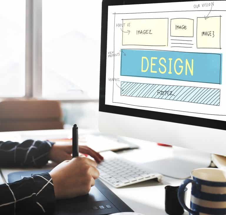
Design Layouts and Visual Hierarchy
Think about the last time you read a menu at a restaurant—your eyes likely went straight to the specials or highlighted items. That’s visual hierarchy in action, guiding you to the most important information first.
Visual hierarchy is the design principle that directs the viewer’s eye, ensuring they notice the most important elements first. It involves organizing content in a way that naturally prioritizes key messages, helping users absorb information effortlessly.
Whether it’s a bold headline, a vibrant image, or a call-to-action button, a well-structured hierarchy leads to better user engagement and retention.
The Role of Symmetry and Balance:
A balanced layout creates a sense of stability and professionalism, fostering trust in your brand. Symmetry, where elements are evenly distributed, appeals to our innate desire for order, making designs feel harmonious and approachable. However, intentional asymmetry can add dynamism and draw attention to specific elements, especially when used sparingly.
The key is to align your layout with your brand’s tone—balanced for dependability or asymmetrical for creativity.
Looking to make your brand’s story unforgettable? At Pascual Creative, we specialize in crafting design solutions that speak directly to your audience. Let’s bring your brand’s personality to life—one thoughtful detail at a time.
Effective Layout Strategies:
- Z-Pattern and F-Pattern Layouts: These layouts align with natural reading patterns, making them ideal for websites and advertisements. Place critical elements like logos and calls-to-action in the “hot zones” of these patterns.
- Whitespace: Incorporating ample spacing keeps your design uncluttered, improving readability and emphasizing key elements.
- Contrast and Scale: Use size and color contrasts to highlight crucial information, such as headlines or product features.
Thoughtfully designed layouts not only make content visually appealing but also improve user interaction by subtly guiding their journey through your brand story.
Integrating Colors, Fonts, and Layouts for Maximum Engagement
When colors, fonts, and layouts work together seamlessly, they create a cohesive brand identity that leaves a lasting impression. This synergy isn’t just about looking good—it’s about crafting a consistent experience that resonates emotionally and visually with your audience. Each element plays a unique role, but their combined impact is what turns good design into great branding.
For example, pairing a calming blue color palette with clean sans-serif fonts and a balanced layout can reinforce professionalism and trust, ideal for a financial services brand.
On the other hand, vibrant colors, playful typography, and asymmetrical layouts convey energy and creativity, making them perfect for lifestyle or entertainment brands.
Here are tips to harmonize your design:
- Align with Your Brand’s Personality: Ensure your color palette, typography, and layout reflect your brand’s core values and tone.
- Establish Visual Consistency: Use the same fonts, color schemes, and design patterns across all platforms to build recognition.
- Prioritize User Experience: Test layouts to ensure they guide users naturally, with a clear hierarchy and easy navigation.
- Keep It Balanced: Avoid overwhelming the viewer by using whitespace to let design elements breathe.
Case Studies: Successful Application of Design Psychology
Spotify
Spotify’s vibrant green logo, combined with sleek sans-serif fonts and intuitive layouts, exemplifies how design psychology drives engagement. The bright green symbolizes energy and growth, aligning with the brand’s youthful, innovative image. Paired with a layout that prioritizes user-friendly navigation, Spotify keeps users exploring playlists for hours.

Takeaway: Align colors, fonts, and layouts with your audience’s preferences to build a strong emotional connection.
Airbnb
Airbnb’s soft pastel color palette, rounded fonts, and inviting layouts create a sense of warmth and community. These elements work together to make users feel welcome, whether they’re browsing homes or reading reviews.
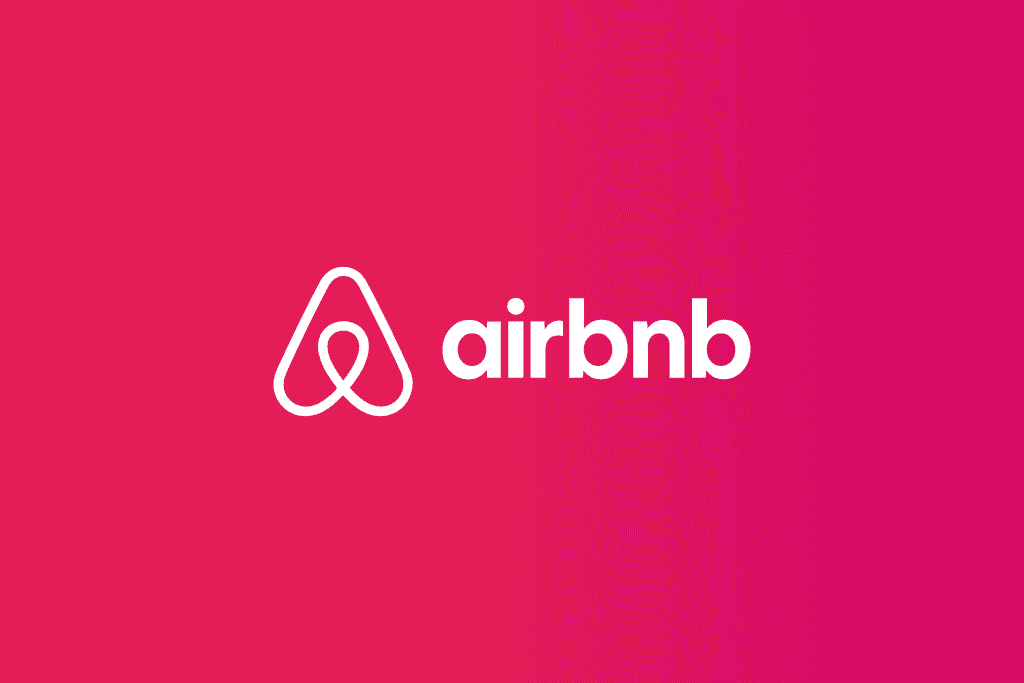
Takeaway: Use design elements to reflect the emotional experience you want users to associate with your brand.
Amazon
Amazon’s homepage layout employs the F-pattern to guide user attention naturally, with orange buttons (a color linked to energy and urgency) that encourage action. Paired with its sans-serif typography and clear categorization, the design maximizes usability and conversions.
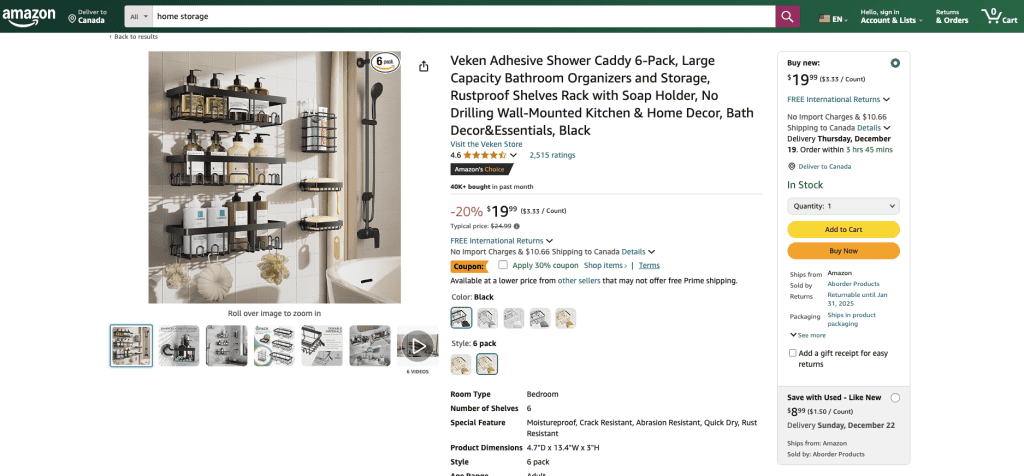
Takeaway: Strategic layout and contrasting colors can drive actions and improve navigation.
Conclusion
Understanding design psychology isn’t just a creative exercise—it’s a strategic advantage. By thoughtfully combining colors, fonts, and layouts, you can create a brand experience that resonates deeply with your audience and drives meaningful engagement. Take the time to align these elements with your brand’s personality and message, and you’ll turn every interaction into an opportunity to build trust and loyalty.
Ready to transform your brand with designs that captivate and convert? At Pascual Creative, we bring your story to life with expert branding, web design, and content solutions tailored to your audience. Let’s create something extraordinary together—get in touch today!